
UI DESIGN & STRATEGY - FRONT END DEVELOPMENT
Company - Accenture Client - AT&T Product Type - Internal Enterprise Web Platform
My role - Designed, developed, and tested user-centric functionalities while collaborating with cross-functional teams and
supporting production deployments.
Ownership - UI/UX strategy, workflow design, Lease Commencement design and development.
Tools - Figma, Photoshop, VS code, IntelliJ, JIRA
Team - Product Manager, Product Owners, DBA, Backend & Frontend Engineers, QA Engineers
Timeline - 3 Years 5 Months
Project Overview
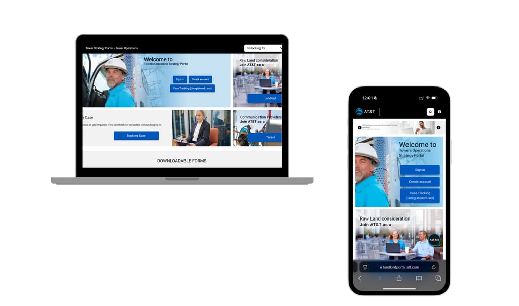
The LMPS Portal helps AT&T and property managers stay connected while managing thousands of telecom tower leases. It supports coordination between landlords, tenants, and internal teams, while ensuring renewals, payments, and site tasks happen on time.
The platform gives property owners a simple way to view lease details, manage their properties, and communicate with AT&T
about network equipment and site needs.
Business Context & Risk - It is a critical enterprise system that helps teams track site related activities, and support internal decision making. When the system is inefficient or unreliable, it can directly impact revenue, compliance, and overall operational risk.
Faster task completion through simplified workflows
Reduction in navigation time with clear, role based actions
Performance improvement from UI and system optimizations
Faster responses through improved visibility and notifications
25%
15%
30%
2–3 hrs
Impact Highlights
Problem Statement
The Business problem - Managing leases across multiple AT&T properties was inefficient. Landlords faced challenges with respect to lease managements, tenants found the forms complex, and managers lacked real-time visibility.
01
Our Primary users -
Landlords: Needed clear lease related features and automated notifications.
Tenants: Required an easier way to access and submit lease-related forms.
AT&T Managers: Needed real-time insights and better control over lease operations.
02
The Need for a Redesign - Users struggled with inconsistent UI elements and poor readability which made the website cumbersome and reduced efficiency.
03
Transforming Lease Management: Key contributions I made while working on this platform
Improved role base access
By designing custom dashboards tailored to landlords, tenants, and managers, ensuring each role had access to the necessary actions while maintaining security and usability.
Modernized the look & feel
Clients found the old design outdated, so we redesigned all UI elements : icons, pop-ups, tables, typography, colors, and H&F for better readability and consistency.
Optimized front end Components
By refactoring components and reducing API calls.


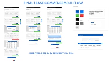
This case study focuses specifically on the Lease Commencement experience and automated notifications, a critical moment where new tower leases are activated and payments officially begin.
I worked on simplifying this flow by reducing manual steps, improving clarity around required actions, and ensuring the right information reached the right users at the right time.

Lease Commencement: Focused Scope - Work I Led end to end (0 -> 1)
Design and Development
User Research - Understanding Users & Identifying Gaps


I wanted to understand users where they already were, before introducing anything new. So I started by digging into pain points across existing features like lease creation, payments, and related tasks.
From there, I began asking more targeted questions to uncover where users were getting stuck, what slowed them down, and what they needed more clarity around.
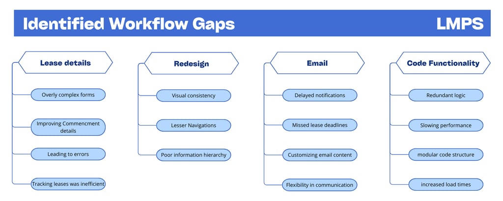
This section highlights the specific pain points faced by different user roles and Identifying Gaps.
Key Challenges in the Existing Portal
01
Workflows were fragmented across different user roles
04
Interfaces were dense and table heavy, hiding critical actions
02
Navigation patterns were inconsistent across modules
05
Limited visibility into timelines and status
03
Heavy reliance on manual follow ups
Limited system feedback
06
Design strategy
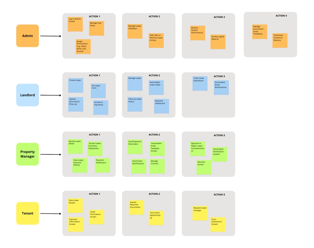
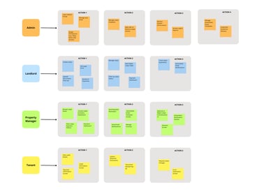
Role-Based Navigation for Enhanced User Experience
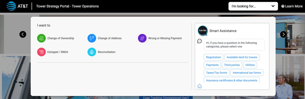
To manage diverse user interactions within the AT&T Landlord Portal, a Role-Based User Flow was created. This visual guide maps pathways for roles like Landlords, Tenants, Property Managers, and Admins, each assigned specific screens/forms and tasks with respect to lease. As the platform expanded with additional users and features, the number of role-specific screens increased, ensuring specified functionality for each user type.
Design Strategy
Role-Specific Dashboards - Each role sees only relevant tasks, reducing clutter and cognitive load
Dynamic UI Components - Forms, buttons, and navigation adjust based on user roles, ensuring access to the right actions
Guided Workflows - Users are led step-by-step through lease actions based on their role, minimizing errors
Smart Alerts & Notifications - Timely reminders (e.g., lease approvals for managers, expirations for landlords) prompt necessary actions
Scalable UI Components - Reusable, modular elements (e.g., adaptive tables, expandable sections) ensure easy growth and updates
Developer Approach
Role-Specific Dashboards - Used JWT or API responses to retrieve user roles upon login
Conditional UI Components - Used restricted actions using disabled states / backend role verification
Guided Navigation - Implemented step-by-step forms that displayed relevant fields based on the user’s progress.
Smart Alerts & Notifications - Used polling APIs to fetch real-time lease updates
Scalable UI Components - Parent-child component structure for better maintainability
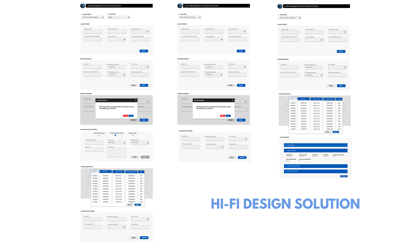
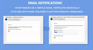
Lease Commencement
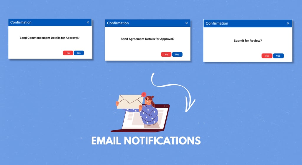
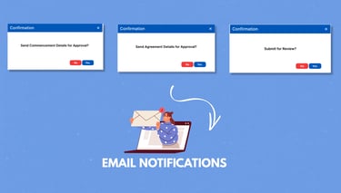
Email Notification
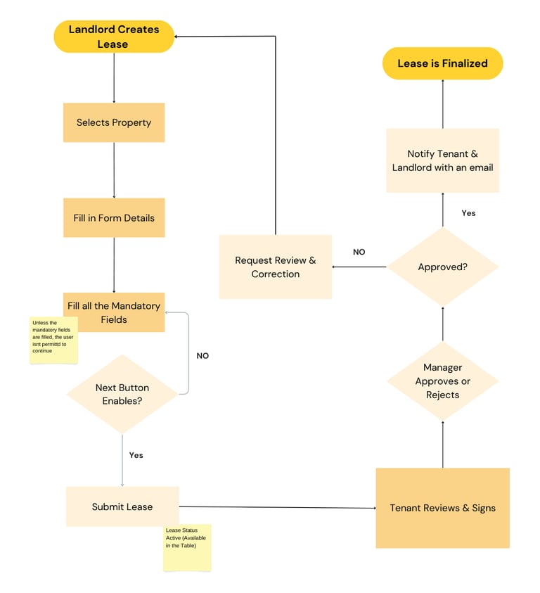
In the AT&T Landlord Portal, the lease process ensures seamless management. The landlord selects a property, fills in details, and completes mandatory fields before submitting. The tenant then reviews, signs, and forwards it for approval.
The manager either:
✔Approves → Notifies the tenant and landlord, finalizing the lease with an email.
✗ Rejects → Sends it back for corrections.
Once active, leases are categorized as Active, Renewed, Expired, or Terminated and are displayed in a searchable and filterable table.
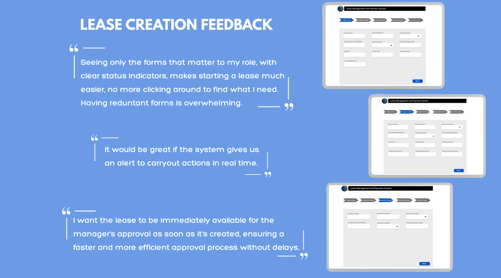
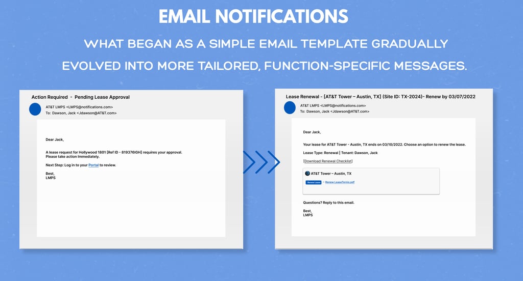
While the lease creation feature existed before I joined the project, I worked on key modifications and enhancements like Email Notifications. The flowchart is a simplified view, as the system includes many additional features.
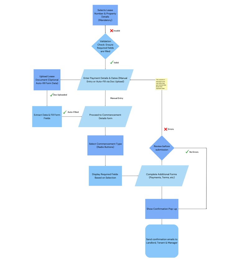
The process begins with two mandatory fields: Lease Number and Property Details. Only after selecting these can the user proceed.
Next, the user fills in key financial details like payment amount, renewal dates, and can either manually enter details or upload a document to auto-fill fields.
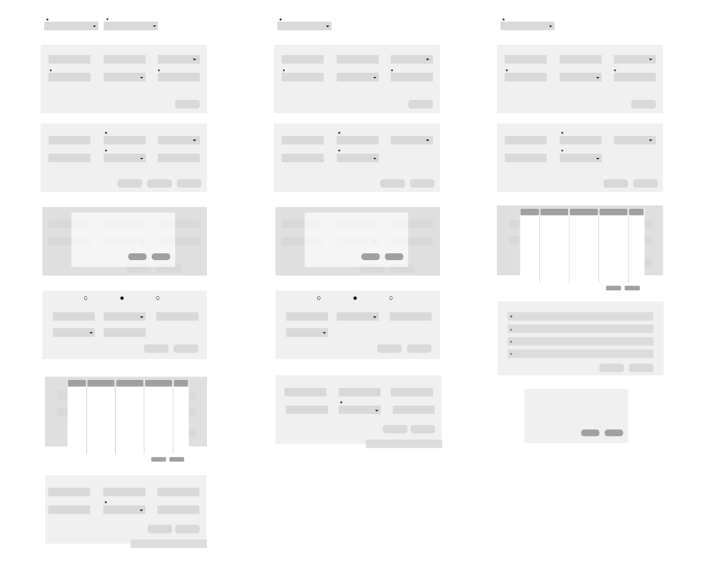
In the Commencement Details form, selecting one of three radio button options dynamically displays relevant fields. This feature was added as the commencement details had more number of fields and details.
After completing additional payment and lease-related forms, a confirmation pop-up ensures all details are verified before submission.
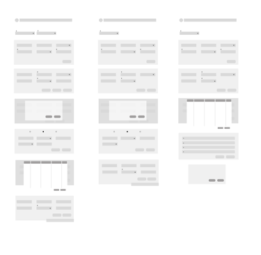
This is a visual representation of role-specific features and actions, streamlining the process for different users.
Landlord
Tenant
Manager
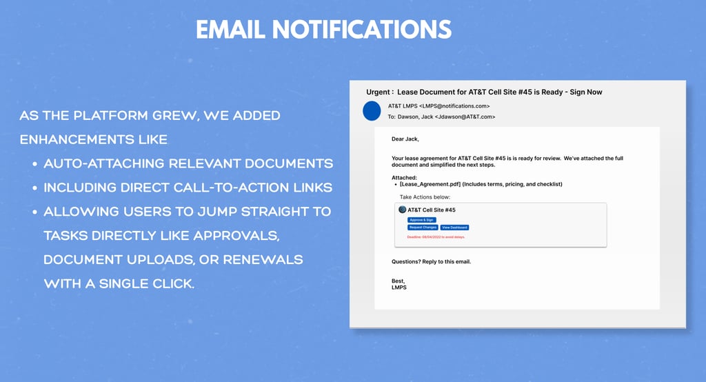
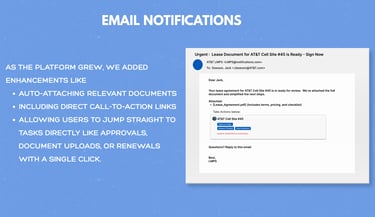
AT&T teams needed real-time visibility into ongoing lease activities including approvals, document submissions, and site updates. Without timely alerts, managers were forced to rely on manual follow-ups, resulting in delayed responses and poor coordination.
To address this, we implemented an email notification system to ensure timely updates and improve overall communication.


40% reduction in missed Lease Renewals
Improved responses by
2-3hrs Avg
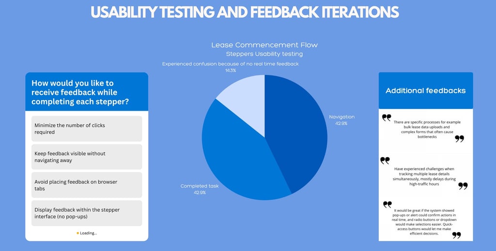

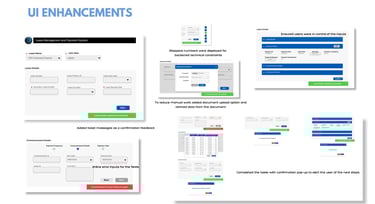
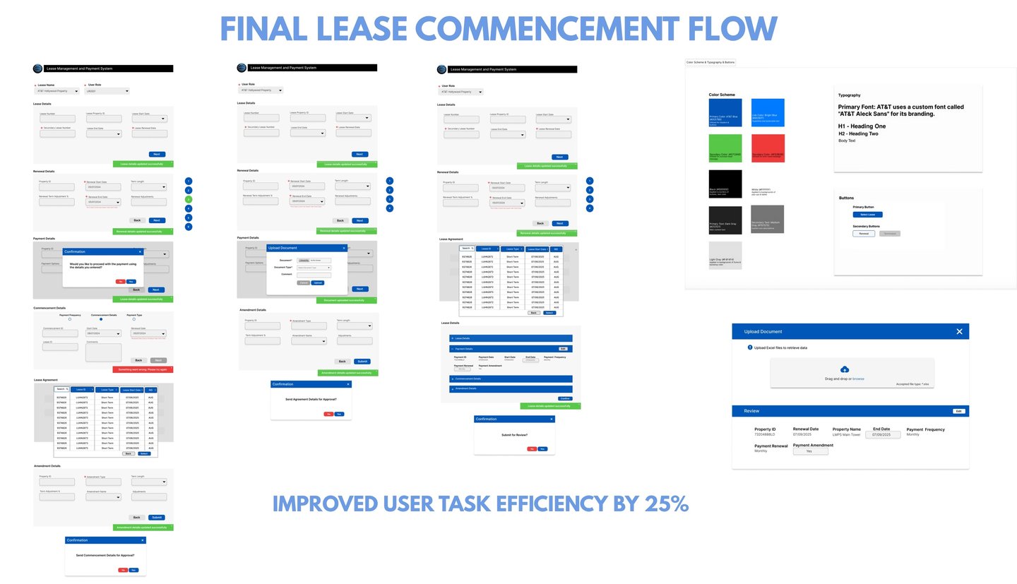
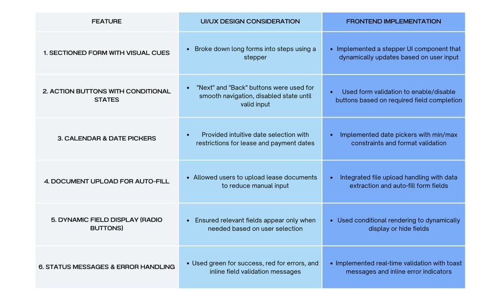
User selects input from the dropdown & based on that the steppers are displayed
Broke down long forms into steps using a stepper
“Next” and “Back” buttons enabled smooth navigation; buttons disabled until valid input
Showed only relevant fields based on user selections to reduce visual clutter
Provided intuitive date selection with restrictions for lease and payment dates
Agile Development & Iterative Testing Workflow


Before development, we followed a detailed scripted test outline with clear instructions to ensure comprehensive testing. Onsite users participated in testing the design firsthand, offering valuable feedback that guided improvements.
During the Development Phase, I developed the UI with Angular, where I created structured pages and reusable components to ensure scalability. To have consistent look & feel across the project, I designed dedicated CSS files that enhanced the visual appeal of the interface.
For data integration, I initially worked with JSON files to validate UI behavior before connecting to live data, to ensure that everything was functioning correctly before integrating with the API, which fetched real-time data from the database.
After completing the development and integration steps, the code was deployed to the main branch. Post-deployment testing played a crucial role in ensuring the system’s stability and performance.
To maintain high-quality standards, iterative testing was conducted, refining the design and functionality at each stage. Finally, the feature underwent rigorous testing by Product Managers, ensuring it aligned with goals and delivered a seamless user experience.
Actively supported production deployments on call and performing thorough testing. In the event of functionality issues, promptly implemented & deployed immediate fixes. This proactive approach resulted in a 30% improvement in operational efficiency.
Key Challenges & Solutions
Time Constraints on Feature Implementation - Rapid development needed while ensuring iterative testing. Hence, we prioritized features using an agile approach, conducting quick design & development iterations based on feedback.
Iterative Testing Complexity - Features required multiple refinement cycles before finalization. Therefore, used prototype testing with real users, collected feedback at each iteration for incremental improvements.
Data-Driven Decision Making – Design choices was aligned with user needs and business goals by conducting usability testing and analyzing key performance metrics before finalizing UI updates.
Handling Large Data Sets – Lease data needed to load efficiently without performance issues. Used lazy loading and optimized API calls to improve performance.
Testing & Deployment Efficiency – Prevented production issues while maintaining deployment speed by following unit testing, integration testing, and manual UAT, ensuring a smooth transition to production.
Reflection


